Playback starts YouTube’s embedded player (privacy-enhanced mode).
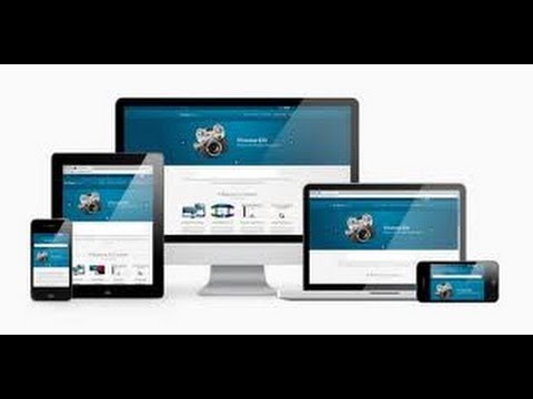
HOW TO CREATE A RESPONSIVE WEBSITE AUTOMATICALLY FITS ANY SCREEN SIZES? VIDEO TRAINING TUTORAIL
ChannelMIROHANYDescription from the creator
Watch the full tutorial on tinyurl.com/Creating-Responsive-Web-Design
Learn to create a web design that automatically conforms itself to multiple screen sizes. This course will show you a step-by-step process for creating a design that rearranges content, resizes elements, and adapts itself based on the size of your visitor's screen size.
Learn how to reposition the main navigation of the site based on the device browsing your website.
We'll create a web design that makes use of HTML5 and CSS3, while maintaining backwards compatibility with older browsers. The secret ingredient of CSS3 that makes this all possible is the media querying capability. CSS media queries allow us to define CSS rules based on screen size, and ultimately give us precise control over how our designs adapt to different screen sizes. In addition to adjusting layout, we'll explore using CSS to define all imagery in our design, allowing us to send optimized imagery along with our customized design experience.
Apply varied amounts of compression to images to optimize download speeds across devices.
Course includes HTML, CSS, and Photoshop templates for use in your own multiscreen web design projects.
Learn to create a web design that automatically conforms itself to multiple screen sizes. This course will show you a step-by-step process for creating a design that rearranges content, resizes elements, and adapts itself based on the size of your visitor's screen size.
Learn how to reposition the main navigation of the site based on the device browsing your website.
We'll create a web design that makes use of HTML5 and CSS3, while maintaining backwards compatibility with older browsers. The secret ingredient of CSS3 that makes this all possible is the media querying capability. CSS media queries allow us to define CSS rules based on screen size, and ultimately give us precise control over how our designs adapt to different screen sizes. In addition to adjusting layout, we'll explore using CSS to define all imagery in our design, allowing us to send optimized imagery along with our customized design experience.
Apply varied amounts of compression to images to optimize download speeds across devices.
Course includes HTML, CSS, and Photoshop templates for use in your own multiscreen web design projects.
About this tutorial
MIROHANY published this 4:24 video tutorial on November 15, 2013. It has been watched 196,071 times on YouTube.
Share
This tutorial in other languages
- FRCOMMENT CRÉER UN SITE SENSIBLE FITS TOUS AUTOMATIQUEMENT Résolution écran? VIDEO FORMATION TUTORAIL
- ESCÓMO CREAR UN responsiva Se ajusta automáticamente cualquier tamaño de pantalla? VIDEO DE FORMACIÓN tutorail
- PTCOMO CRIAR UM SITE RESPONSIVO AUTOMATICAMENTE Serve para qualquer tamanhos de tela? VIDEO DE TREINAMENTO TUTORAIL
- ITCOME CREARE UN SITO REATTIVO FITS automaticamente qualsiasi dimensioni dello schermo? VIDEO DI FORMAZIONE TUTORAIL
- DESo erstellen Sie eine RESPONSIVE-Website keine Bildschirmgrößen AUTOMATISCH FITS? VIDEO TRAINING TUTORAIL
- NLHOE MAAK een responsieve WEBSITE AUTOMATISCH past op elke schermafmetingen? VIDEO TRAINING tutorail
- RUКак создать адаптивный САЙТ АВТОМАТИЧЕСКИ приспосабливает любой размер экрана? ВИДЕО ОБУЧЕНИЕ TUTORAIL
- PLJak stworzyć elastycznej witryny AUTOMATYCZNIE Odpowiada wszystkim rozmiarach ekranu? VIDEO SZKOLENIE TUTORAIL
- JA自動的に応答性のウェブサイトを作成する方法を任意の画面サイズに合いますか?ビデオトレーニングTUTORAIL
- ARHOW TO إنشاء موقع على الشبكة تستجيب يناسب تلقائيا أي الأحجام SCREEN؟ VIDEO TRAINING TUTORAIL
- HIकैसे बनाएं एक संवेदनशील वेबसाइट स्वचालित रूप से किसी भी स्क्रीन आकार फिट बैठता है? वीडियो प्रशिक्षण tutorail
- IDCARA UNTUK MENCIPTAKAN WEBSITE RESPONSIF OTOMATIS FITS APAPUN UKURAN LAYAR? VIDEO PELATIHAN tutorail