Playback starts YouTube’s embedded player (privacy-enhanced mode).
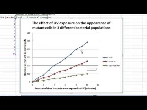
How to make a line graph in Excel (Scientific data)
ChannellginesDescription from the creator
Click here to check out the updated version of this video:
youtu.be/6YloTh7ZNN8?si=FRyTAqg0u5BW3OoW
youtu.be/6YloTh7ZNN8?si=FRyTAqg0u5BW3OoW
About this tutorial
lgines published this 6:42 video tutorial on November 2, 2013. It has been watched 4,361,418 times on YouTube.
Tags
Share
This tutorial in other languages
- FRComment faire un graphique de ligne dans Excel (données scientifiques)
- ES¿Cómo hacer un gráfico de líneas en Excel (Los datos científicos)
- PTComo fazer um gráfico de linha no Excel (dados Scientific)
- ITCome fare un grafico a linee in Excel (Dati scientifici)
- DEWie ein Liniendiagramm in Excel (Wissenschaftliche Daten) machen
- NLHoe maak je een lijngrafiek maken in Excel (Scientific data)
- RUКак сделать линейный график в Excel (Научные данные)
- PLJak zrobić wykres liniowy w Excelu (dane naukowe)
- JAどのようにExcelで折れ線グラフを作成するには(科学的データ)
- ARكيفية جعل خط الرسم البياني في Excel (البيانات العلمية)
- HIकैसे Excel में एक लाइन ग्राफ़ बनाने के लिए (वैज्ञानिक डेटा)
- IDCara membuat grafik garis di Excel (data Ilmiah)