Playback starts YouTube’s embedded player (privacy-enhanced mode).
How to write like an architect
ChannelHow to ArchitectDescription from the creator
Take the 'How to Write Like an Architect Course,' Plus get Doug's hand written architecture font.
thearchitectsacademy.usefedora.com/p/how-to-wri…
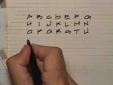
Hi Im Doug Patt and this is how to architect. Today well learn How to write like an architect. The basic drafting tool for an architect when working by hand is a parallel rule. You can also use a t-square. Ill be using an ames lettering guide to create the lines for the lettering. First were going to create our horizontal lines using the lettering guide. The guide has a variety of spacing options to create just about any combination your looking for. I will also be using a small triangle. Ive added tape to this one for ink lettering to avoid smearing. Ill also be using a .5mm pentel drafting pencil and a paper mate, flair pen for the letters. Ive created a small grid here to give me some guidance when I lay out the letters. Id say the most important thing to remember about hand lettering is that your letters need to seem animated while still appearing orderly and neat. I think this is achieved by using a few conventions. For example, youll notice the letters have some amount of incompleteness. The second diagonal on the A does not follow all the way to the guide line, the bottom of the B or D isnt complete, The bottom line on the E starts in front of the vertical. The second thing is that all the horizontals in the letters are drawn by hand, not using the parallel rule. They all sit at a slight angle making them dynamic and yet uniform. Youll also notice that I use the ruler for all vertical lines. Lastly, when making your Os, Qs, Cs, Gs, even 8s and 9s, the letters and numbers are simply combinations of semi circles. Even the letter S is made the same way. These are two images from my portfolio. They are good examples of how your strings of words will come together to form orderly yet animated paragraphs. This is a quote I found from Tyron Edwards Dictionary of thoughts I enjoy referring to from time to time. It seemed appropriate for a youtube video because giving people the most amount of knowledge in the least amount of time is really what drives the information age. So, remember hand lettering is about style and legibility. Mine is definitely stylized and probably a little tough to read sometimes. So thanks for checking out how to write like an architect. Im Doug
thearchitectsacademy.usefedora.com/p/how-to-wri…
Hi Im Doug Patt and this is how to architect. Today well learn How to write like an architect. The basic drafting tool for an architect when working by hand is a parallel rule. You can also use a t-square. Ill be using an ames lettering guide to create the lines for the lettering. First were going to create our horizontal lines using the lettering guide. The guide has a variety of spacing options to create just about any combination your looking for. I will also be using a small triangle. Ive added tape to this one for ink lettering to avoid smearing. Ill also be using a .5mm pentel drafting pencil and a paper mate, flair pen for the letters. Ive created a small grid here to give me some guidance when I lay out the letters. Id say the most important thing to remember about hand lettering is that your letters need to seem animated while still appearing orderly and neat. I think this is achieved by using a few conventions. For example, youll notice the letters have some amount of incompleteness. The second diagonal on the A does not follow all the way to the guide line, the bottom of the B or D isnt complete, The bottom line on the E starts in front of the vertical. The second thing is that all the horizontals in the letters are drawn by hand, not using the parallel rule. They all sit at a slight angle making them dynamic and yet uniform. Youll also notice that I use the ruler for all vertical lines. Lastly, when making your Os, Qs, Cs, Gs, even 8s and 9s, the letters and numbers are simply combinations of semi circles. Even the letter S is made the same way. These are two images from my portfolio. They are good examples of how your strings of words will come together to form orderly yet animated paragraphs. This is a quote I found from Tyron Edwards Dictionary of thoughts I enjoy referring to from time to time. It seemed appropriate for a youtube video because giving people the most amount of knowledge in the least amount of time is really what drives the information age. So, remember hand lettering is about style and legibility. Mine is definitely stylized and probably a little tough to read sometimes. So thanks for checking out how to write like an architect. Im Doug
About this tutorial
How to Architect published this 2:36 video tutorial on October 29, 2008. It has been watched 2,088,844 times on YouTube.
- Channel
- How to Architect
- Category
- Education
- Duration
- 2:36
- Published
- October 29, 2008
- Views
- 2,088,844
- Likes
- 13,392
Tags
Share
This tutorial in other languages
- FRComment écrire comme un architecte
- ESCómo escribir como un arquitecto
- PTComo escrever como um arquiteto
- ITCome scrivere come un architetto
- DEWie wie ein Architekt schreiben
- NLHoe om te schrijven als een architect
- RUКак написать как архитектор
- PLJak napisać jak architekt
- JA建築家のような書き方
- ARكيفية كتابة مثل مهندس معماري
- HIएक वास्तुकार की तरह लिखने के लिए कैसे
- IDBagaimana menulis seperti seorang arsitek