Playback starts YouTube’s embedded player (privacy-enhanced mode).
How to Create a Responsive WordPress Website with Elementor + Astra Theme
ChannelElementor Website Builder for WordPressDescription from the creator
Learn how to create a mobile responsive WordPress website, no coding needed. See this template in action: library.elementor.com/snowboard-site-homepage/
and insert it with one click using Elementor's Template Library
Everyone knows about the importance of creating a responsive website that looks smashing on desktop, tablet and mobile devices.
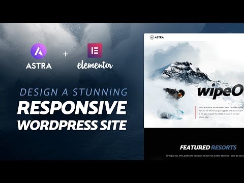
In this tutorial, we explain step by step how to create a stunning one page WordPress website with the FREE Elementor and Astra theme. We then go on to explain how to customize that page to fit all devices, using Elementor's visual mobile editing tools.
Follow this tutorial to learn how to create not only a regular website, but a website that looks amazing and has that WOW effect.
This way, you don't have to touch CSS code, and can still produce a website that looks one way on desktop, and adapts to get a separate set of style settings on mobile and tablet devices.
== Tools Used ==
Elementor (FREE Plugin): elementor.com
Astra (FREE Theme): wpastra.com
WordPress (FREE): wordpress.org
Elementor Pro: elementor.com/pro
and insert it with one click using Elementor's Template Library
Everyone knows about the importance of creating a responsive website that looks smashing on desktop, tablet and mobile devices.
In this tutorial, we explain step by step how to create a stunning one page WordPress website with the FREE Elementor and Astra theme. We then go on to explain how to customize that page to fit all devices, using Elementor's visual mobile editing tools.
Follow this tutorial to learn how to create not only a regular website, but a website that looks amazing and has that WOW effect.
This way, you don't have to touch CSS code, and can still produce a website that looks one way on desktop, and adapts to get a separate set of style settings on mobile and tablet devices.
== Tools Used ==
Elementor (FREE Plugin): elementor.com
Astra (FREE Theme): wpastra.com
WordPress (FREE): wordpress.org
Elementor Pro: elementor.com/pro
About this tutorial
Elementor Website Builder for WordPress published this 25:43 video tutorial on November 13, 2018. It has been watched 142,840 times on YouTube.
- Category
- Howto & Style
- Duration
- 25:43
- Published
- November 13, 2018
- Views
- 142,840
- Likes
- 1,628
Share
This tutorial in other languages
- FRComment faire pour créer un site Web WordPress Responsive avec Elementor + Astra Theme
- ESCómo crear un sitio web de WordPress sensible que proporciona un Elementor + Astra temático
- PTComo criar um site WordPress Responsive com Elementor + Astra Tema
- ITCome creare un sito web WordPress reattiva con Elementor + Astra Theme
- DESo erstellen Sie eine Responsive Wordpress-Website mit Elementor + Astra Theme
- NLHoe maak je een Responsive WordPress Website met Elementor + Astra Thema maken
- RUКак создать Отзывчивый WordPress сайт с Факир + Astra Theme
- PLJak utworzyć Responsive WordPress Website z Elementor + Astra tematu
- JAElementor +アストラのテーマで応答ワードプレスのウェブサイトを作成する方法
- ARكيفية إنشاء وورد موقع المتجاوب مع Elementor + أسترا الموضوع
- HIElementor + एस्ट्रा थीम के साथ एक उत्तरदायी वर्डप्रेस वेबसाइट बनाने के लिए कैसे
- IDCara Membuat Website WordPress Responsif dengan Elementor + Astra Tema