Playback starts YouTube’s embedded player (privacy-enhanced mode).
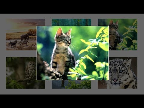
How To Create Image Gallery Using HTML, CSS and Javascript | Lightbox Gallery
ChannelClever TechieDescription from the creator
Upgrade your Clever Techie learning experience:
patreon.com/clevertechie
UPDATE! (9/13/19) New features and improvements for Clever Techie Patreons:
1. Download full source code with detailed comments - easy to learn and understand code
2. Weekly source code file updates by Clever Techie - every time I learn new things about a topic I will add it to the source file and let you know about the update - keep up with the latest coding technologies
3. Library of custom Clever Techie functions with descriptive, easy to understand comments - skyrocket coding productivity, code more efficiently by using Clever library of custom re-usable functions
4. Syntax code summary - memorize and review previously learned code faster
4. Organized file structure - access all Clever Techie lessons, source code, graphics, diagrams and cheat sheet from a single workspace - no more searching around for previously covered material and source code - save enormous amount of time and effort
5. Outline of topics the source file covers - fast review of all previously learned coding lessons
6. Access to all full HD 1080p videos with no ads
7. Console input examples - interactive examples that make it easier to understand and learn coding
8. Access to updated PHP Programming Book by Clever Techie
9. Early access to Clever Techie videos
Subscribe to Clever Techie patreon:
patreon.com/clevertechie
Learn how to create image gallery with HTML, CSS and Javascript. We're also going to implement a package called Lightbox which makes creating image galleries a breeze. This is a very easy tutorial that uses basic HTML, the point is to see how easily we can implement Lightbox and basic HTML with CSS to quickly create the image gallery.
``````````````````````````````````````````````````````````````````````````````````````````````
Hey guys, I'm now using Patreon to share improved and updated video content and source files. For a small fee you can access all the downloadable files from this lesson (source code, icons & graphics, cheat sheets, OneNote notes) and everything else included in the video from the Patreon page. Additionally, you will get access to ALL Clever Techie videos in HD format with no ads. Thank you so much for supporting Clever Techie :)
Download this video's files here:
patreon.com/posts/how-to-create-21449049
( You also get access to ALL source code and any downloadable content of ALL Clever Techie videos, as well as access to ALL videos in HD 1080p quality format with all video ads removed! )
`````````````````````````````````````````````````````````````````````````````````````````````
( Website ) clevertechie.com - PHP, JavaScript, Wordpress, CSS, and HTML tutorials in video and text format with cool looking graphics and diagrams.
( YouTube Channel ) youtube.com/c/CleverTechieTube
( Google Plus ) goo.gl/J71p6f - clever techie video tutorials.
( Facebook ) facebook.com/CleverTechie/
( Twitter ) twitter.com/theclevertechie
patreon.com/clevertechie
UPDATE! (9/13/19) New features and improvements for Clever Techie Patreons:
1. Download full source code with detailed comments - easy to learn and understand code
2. Weekly source code file updates by Clever Techie - every time I learn new things about a topic I will add it to the source file and let you know about the update - keep up with the latest coding technologies
3. Library of custom Clever Techie functions with descriptive, easy to understand comments - skyrocket coding productivity, code more efficiently by using Clever library of custom re-usable functions
4. Syntax code summary - memorize and review previously learned code faster
4. Organized file structure - access all Clever Techie lessons, source code, graphics, diagrams and cheat sheet from a single workspace - no more searching around for previously covered material and source code - save enormous amount of time and effort
5. Outline of topics the source file covers - fast review of all previously learned coding lessons
6. Access to all full HD 1080p videos with no ads
7. Console input examples - interactive examples that make it easier to understand and learn coding
8. Access to updated PHP Programming Book by Clever Techie
9. Early access to Clever Techie videos
Subscribe to Clever Techie patreon:
patreon.com/clevertechie
Learn how to create image gallery with HTML, CSS and Javascript. We're also going to implement a package called Lightbox which makes creating image galleries a breeze. This is a very easy tutorial that uses basic HTML, the point is to see how easily we can implement Lightbox and basic HTML with CSS to quickly create the image gallery.
``````````````````````````````````````````````````````````````````````````````````````````````
Hey guys, I'm now using Patreon to share improved and updated video content and source files. For a small fee you can access all the downloadable files from this lesson (source code, icons & graphics, cheat sheets, OneNote notes) and everything else included in the video from the Patreon page. Additionally, you will get access to ALL Clever Techie videos in HD format with no ads. Thank you so much for supporting Clever Techie :)
Download this video's files here:
patreon.com/posts/how-to-create-21449049
( You also get access to ALL source code and any downloadable content of ALL Clever Techie videos, as well as access to ALL videos in HD 1080p quality format with all video ads removed! )
`````````````````````````````````````````````````````````````````````````````````````````````
( Website ) clevertechie.com - PHP, JavaScript, Wordpress, CSS, and HTML tutorials in video and text format with cool looking graphics and diagrams.
( YouTube Channel ) youtube.com/c/CleverTechieTube
( Google Plus ) goo.gl/J71p6f - clever techie video tutorials.
( Facebook ) facebook.com/CleverTechie/
( Twitter ) twitter.com/theclevertechie
About this tutorial
Clever Techie published this 10:39 video tutorial on October 25, 2018. It has been watched 294,339 times on YouTube.
- Channel
- Clever Techie
- Category
- Howto & Style
- Duration
- 10:39
- Published
- October 25, 2018
- Views
- 294,339
- Likes
- 4,566
Tags
Share
Further reading
-
How to create an image gallery with CSS Grid
freecodecamp.org
Image galleries made by websites like Unsplash, Pinterest Etc, are made by techniques like positioning or translating the image item which is a very cumbersome task to do. You can achieve the same functionality very qui…
-
How to create a responsive image gallery with CSS
tutorialspoint.com
To create a responsive image gallery with CSS, you can try to run the following codeExampleLive Demo<!DOCTYPE html>
-
How To Create a Portfolio Gallery - W3Schools
w3schools.com
Portfolio Gallery. Learn how to create a responsive portfolio gallery that varies between 4 columns, 2 columns and full-width columns depending on screen width:
This tutorial in other languages
- FRComment faire pour créer Galerie d'image en utilisant HTML, CSS et Javascript | Galerie Lightbox
- ESCómo Crear galería de imágenes El uso de HTML, CSS y Javascript | Galería de la mesa de luz
- PTComo Criar Galeria de Imagens Usando HTML, CSS e Javascript | Lightbox Gallery
- ITCome creare galleria di immagini utilizzando HTML, CSS e Javascript | ID Galleria
- DEWie die Bilder-Galerie mit HTML, CSS und Javascript erstellen | Lightbox-Galerie
- NLHow To Fotogalerij maken met behulp van HTML, CSS en Javascript | lightbox Gallery
- RUКак создать Галерея изображений с помощью HTML, CSS и Javascript | Lightbox галерея
- PLJak utworzyć Galerię Korzystanie z HTML, CSS i JavaScript | Lightbox Gallery
- JAHTML、CSSおよびJavaScriptを使用してイメージギャラリーを作成する方法|ライトボックスギャラリー
- ARكيفية إنشاء معرض الصور عن طريق HTML، CSS وجافا سكريبت | صندوق معرض
- HIकैसे छवि गैलरी बनाने के लिए HTML, सीएसएस और जावास्क्रिप्ट का उपयोग करना | लाइटबॉक्स गैलरी
- IDCara Membuat Galeri Menggunakan HTML, CSS dan Javascript | Lightbox Gallery