Playback starts YouTube’s embedded player (privacy-enhanced mode).
How to Match Colors Fast for Composites in Photoshop
ChannelDustin ValkemaDescription from the creator
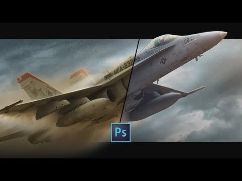
Hey, Creatives! In this video we’ll cover the favorite tried and true method I use most to match colors in Photoshop for composites. It’s fast and quite easy to integrate into your work flow. I use it in nearly every composite either as a base, or final method of asset integration. This is one of many tools you can place into your creative toolbox to pull when you need it.
I used to spend a lot of time getting the “perfect” color match, meticulously tweaking colors with curves, color balance, selective color and other tools. We’ll get into deeper discussions on my feelings of perfection as the channel grows, but learning to trust your vision is key. If it looks right, it is right and getting the experience to know the difference is key. Using tricks like these allow you to spend less time perfecting and more time creating. The main reason I use this method is because it’s fast, effective and makes life easier. Time is money when compositing, retouching and working on commissioned projects and this method is definitely a way to get a good base, if not what you need from the get go.
Things to note when using this method:
- It works great in most cases. Sometimes I’ll use a layer mask on the curves layer and slightly remove the adjustment from skin tones if it’s too heavy.
- Make sure you have the Layer thumbnail selected and not the Layer Mask for the curves. You’ll quickly find out why :D we all do it, often lol
- Pure black and Pure white samples won’t work with this method when matching colors. If you have photos with values that are clipped or pure in value make sure to select the closest range that has color value.
- Make sure to deselect Snap Midtones prior to sampling colors. I don’t like PS defining mid-tones for me. Feel free to try it out and see what works best for you! Everyone has different workflows, might be good for yours.
- Generally speaking, don’t save your target colors as defaults when exiting the Advanced Color Correction Options dialog. If you do you’ll automatically have your selected colors pop in when using this method. It can get annoying if done on accident but can be reverted.
----------------------------------------------------------------------------------
Looking for new Stock Packs? Check them out here 👇
gumroad.com/dustinvalkema
Photographers IG/ @gregydephotography
My IG/ @DustinValkema
----------------------------------------------------------------------------------
Please feel free to leave questions and feedback in the comments! I'd love to know how I can add value to everyone watching.
I've gotten quite a few questions regarding my gear and photo studio setup. Find that below
kit.com/dustinvalkema
I used to spend a lot of time getting the “perfect” color match, meticulously tweaking colors with curves, color balance, selective color and other tools. We’ll get into deeper discussions on my feelings of perfection as the channel grows, but learning to trust your vision is key. If it looks right, it is right and getting the experience to know the difference is key. Using tricks like these allow you to spend less time perfecting and more time creating. The main reason I use this method is because it’s fast, effective and makes life easier. Time is money when compositing, retouching and working on commissioned projects and this method is definitely a way to get a good base, if not what you need from the get go.
Things to note when using this method:
- It works great in most cases. Sometimes I’ll use a layer mask on the curves layer and slightly remove the adjustment from skin tones if it’s too heavy.
- Make sure you have the Layer thumbnail selected and not the Layer Mask for the curves. You’ll quickly find out why :D we all do it, often lol
- Pure black and Pure white samples won’t work with this method when matching colors. If you have photos with values that are clipped or pure in value make sure to select the closest range that has color value.
- Make sure to deselect Snap Midtones prior to sampling colors. I don’t like PS defining mid-tones for me. Feel free to try it out and see what works best for you! Everyone has different workflows, might be good for yours.
- Generally speaking, don’t save your target colors as defaults when exiting the Advanced Color Correction Options dialog. If you do you’ll automatically have your selected colors pop in when using this method. It can get annoying if done on accident but can be reverted.
----------------------------------------------------------------------------------
Looking for new Stock Packs? Check them out here 👇
gumroad.com/dustinvalkema
Photographers IG/ @gregydephotography
My IG/ @DustinValkema
----------------------------------------------------------------------------------
Please feel free to leave questions and feedback in the comments! I'd love to know how I can add value to everyone watching.
I've gotten quite a few questions regarding my gear and photo studio setup. Find that below
kit.com/dustinvalkema
About this tutorial
Dustin Valkema published this 4:11 video tutorial on November 6, 2019. It has been watched 41,049 times on YouTube.
- Channel
- Dustin Valkema
- Category
- Howto & Style
- Duration
- 4:11
- Published
- November 6, 2019
- Views
- 41,049
- Likes
- 2,034
Tags
Share
This tutorial in other languages
- FRComment faire correspondre les couleurs rapide pour Composites dans Photoshop
- ESCómo hacer coincidir los colores rápido para composites en Photoshop
- PTComo combinar as cores rápido para Composites em Photoshop
- ITCome abbinare i colori veloce per compositi in Photoshop
- DEWie Match Farben fasten für Composites in Photoshop
- NLHoe te match kleuren Fast voor Composites in Photoshop
- RUКак подобрать цвета для быстрого Composites в Photoshop
- PLJak dopasować kolory Szybkie kompozytów w Photoshopie
- JAPhotoshopでコンポジットのための高速色と一致する方法
- ARكيفية تطابق الألوان السريع لالمركبات في فوتوشوب
- HIमें फ़ोटोशॉप सम्मिश्र के लिए तेजी से रंग मैच के लिए
- IDBagaimana untuk Match Colors Cepat untuk Komposit di Photoshop