Playback starts YouTube’s embedded player (privacy-enhanced mode).
Powerpoint Tutorial: Make your Pie Charts Look Awesome!
ChannelSlide CowDescription from the creator
MORE TUTORIALS? CLICK HERE: goo.gl/TBZibY
Hello guys!
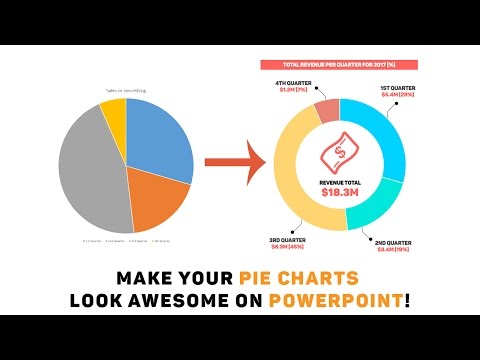
Welcome to our seventh video, and guide, on Powerpoint. Last week, we covered how you all can up your bar game by making your bar charts look awesome in Powerpoint. Following that trend, we are going to be covering pie charts in Powerpoint and making them look awesome.
We see pie charts all the time. Many of them look so bland. So we thought that this would be a good way to spice things up!
So why the sudden focus on data visualization? Well, a lot of the work people do in professional services involves data. And sometimes, data needs to be visually represented so that your audience can seek exactly what they need, when they need to. The best way I can describe the importance of data visualization is by using my “laundry service” analogy.
Imagine you are running a laundry service outlet. A customer comes in, giving you jeans, shirts, socks, underwear, pants, jackets, whatever for you to clean. If you cared about that service, you would take all of those items, clean them, and then package them in such a way they are neatly sorted. When the customer comes by again to pick up those items, they are all neatly stacked, folded, and smell like roses. This way your customer can easily look through the items and finds exactly what he needs to find, rather than receive a ball of items in a plastic bag.
In this video, you will learn how to:
1. Create a pie chart on Powerpoint
2. Know when to use a pie chart on Powerpoint
3. Format your pie chart on Powerpoint
4. Create your very own pointer shape on Powerpoint
5. Emphasize on key data points in your pie chart on Powerpoint
6. Focus on your commentary and analysis on Powerpoint
7. Use colors, icons, and fonts to your advantage to make your data look super appealing!
And much more.
As always, we would love your feedback. Please do like, share, comment and subscribe.
Hello guys!
Welcome to our seventh video, and guide, on Powerpoint. Last week, we covered how you all can up your bar game by making your bar charts look awesome in Powerpoint. Following that trend, we are going to be covering pie charts in Powerpoint and making them look awesome.
We see pie charts all the time. Many of them look so bland. So we thought that this would be a good way to spice things up!
So why the sudden focus on data visualization? Well, a lot of the work people do in professional services involves data. And sometimes, data needs to be visually represented so that your audience can seek exactly what they need, when they need to. The best way I can describe the importance of data visualization is by using my “laundry service” analogy.
Imagine you are running a laundry service outlet. A customer comes in, giving you jeans, shirts, socks, underwear, pants, jackets, whatever for you to clean. If you cared about that service, you would take all of those items, clean them, and then package them in such a way they are neatly sorted. When the customer comes by again to pick up those items, they are all neatly stacked, folded, and smell like roses. This way your customer can easily look through the items and finds exactly what he needs to find, rather than receive a ball of items in a plastic bag.
In this video, you will learn how to:
1. Create a pie chart on Powerpoint
2. Know when to use a pie chart on Powerpoint
3. Format your pie chart on Powerpoint
4. Create your very own pointer shape on Powerpoint
5. Emphasize on key data points in your pie chart on Powerpoint
6. Focus on your commentary and analysis on Powerpoint
7. Use colors, icons, and fonts to your advantage to make your data look super appealing!
And much more.
As always, we would love your feedback. Please do like, share, comment and subscribe.
About this tutorial
Slide Cow published this 22:37 video tutorial on November 15, 2017. It has been watched 164,122 times on YouTube.
- Channel
- Slide Cow
- Category
- Howto & Style
- Duration
- 22:37
- Published
- November 15, 2017
- Views
- 164,122
- Likes
- 1,172
Tags
Share
This tutorial in other languages
- FRPowerpoint Tutoriel: Faites vos camemberts un super look!
- ESPowerpoint Tutorial: Haga que sus gráficos circulares parecen impresionantes!
- PTPowerpoint Tutorial: Faça seus gráficos de pizza olhar impressionante!
- ITPowerpoint Tutorial: Fai la tua Grafici a torta sembrano impressionanti!
- DEPowerpoint-Tutorial: Machen Sie Ihre Pie Charts sehen super aus!
- NLPowerpoint Tutorial: Maak uw cirkeldiagrammen Kijk Awesome!
- RUPowerpoint Учебник: Сделайте ваши Круговые диаграммы выглядеть великолепно!
- PLPowerpoint Tutorial: Make Your Wykresy kołowe Spójrz Awesome!
- JAパワーポイントチュートリアル:あなたの円グラフは素晴らしい見てください!
- ARباور بوينت البرنامج التعليمي: جعل الرسم البياني الدائري مظهرك رائع!
- HIपावरपोइंट ट्यूटोरियल: अपने पाई चार्ट बहुत बढ़िया देखो बनाओ!
- IDPowerpoint Tutorial: Membuat Grafik Pie Anda Lihatlah Awesome!