Playback starts YouTube’s embedded player (privacy-enhanced mode).
How to plot Pareto chart using Excel Sheet with Common Example.
ChannelShashank KapleDescription from the creator
We all know that Pareto is very important Quality Control tool.
It is used for the prioritisation for the selection of Vital few elements among many.
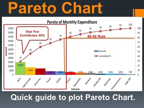
Pareto is a combo chart of bar and Line. Bar shows individual contribution of each element in descending order and line shows cumulative percentage of all elements.
It is based on 80-20 Rule.
After plotting Pareto, we could focus on vital few element for improvement.
Let us see how to plot Pareto by using excel sheet with common example.
It is used for the prioritisation for the selection of Vital few elements among many.
Pareto is a combo chart of bar and Line. Bar shows individual contribution of each element in descending order and line shows cumulative percentage of all elements.
It is based on 80-20 Rule.
After plotting Pareto, we could focus on vital few element for improvement.
Let us see how to plot Pareto by using excel sheet with common example.
About this tutorial
Shashank Kaple published this 8:22 video tutorial on November 11, 2017. It has been watched 49,694 times on YouTube.
- Channel
- Shashank Kaple
- Category
- People & Blogs
- Duration
- 8:22
- Published
- November 11, 2017
- Views
- 49,694
- Likes
- 324
Tags
Share
This tutorial in other languages
- FRComment tracer graphique à l'aide de Pareto feuille Excel avec Common Exemple.
- ESCómo trazar diagrama de Pareto utilizando hoja de Excel con el Ejemplo Común.
- PTComo traçar gráfico de Pareto usando folha de Excel com o Exemplo comum.
- ITCome tracciare diagramma di Pareto utilizzando Excel Foglio con esempio comune.
- DEWie Pareto-Diagramm unter Verwendung von Excel-Tabelle mit Common Beispiel zu zeichnen.
- NLHoe wordt Pareto-diagram plotten met behulp van Excel Sheet met Common voorbeeld.
- RUКак построить диаграмму Парето с использованием Excel листа с общим примером.
- PLJak wykreślić wykres Pareto za pomocą arkusza Excel z typowym przykładem.
- JA一般的な例でExcelシートを使用してパレート図をプロットする方法。
- ARكيفية رسم مخطط باريتو باستخدام ورقة Excel مع المشتركة مثال.
- HIकैसे आम उदाहरण के साथ एक्सेल शीट का उपयोग कर परेटो चार्ट प्लॉट करने के लिए।
- IDBagaimana plot grafik Pareto menggunakan Lembar Excel dengan umum Contoh.