Playback starts YouTube’s embedded player (privacy-enhanced mode).
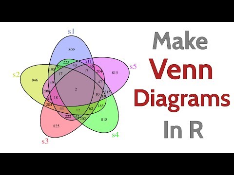
How To Make A Venn Diagram in R
ChannelDataDaftDescription from the creator
Venn diagrams are plots used to graphically display intersections between two or more groups. In this code clip we learn how to construct Venn diagrams in R using the ggplot2 and VennDiagram packages.
#datavisualization #rprogramming #rstats
Code used in this clip:
# Venn diagram with ggplot
library(tidyverse)
library(ggforce) # Adds geom_circle
# DataFrame to specify circle and text positions
data <- data.frame(x = c(0, 1, -1),
y = c(-0.5, 1, 1),
tx = c(0, 1.5, -1.5),
ty = c(-1, 1.3, 1.3),
cat = c('Domain Experience', 'Math',
'Computer Science'))
# Plot circles and text; add annotations for overlapping segments
ggplot(data, aes(x0 = x , y0 = y, r = 1.5, fill = cat)) +
geom_circle(alpha = 0.25, size = 1, color = "black",show.legend = FALSE) +
geom_text(aes(x = tx , y = ty, label = cat), size = 7) +
annotate(geom="text", x=0, y=1.5, label="Machine \n Learning",color="purple", size = 5) +
annotate(geom="text", x=-0.9, y=0, label="Traditional \n Software",color="darkorange", size = 5) +
annotate(geom="text", x=0.9, y=0, label="Traditional \n Research",color="darkgreen", size = 5) +
annotate(geom="text", x=0, y=0.5, label="Data \n Science",color="blue", size = 5) +
theme_void()
# Set plot display size
options(repr.plot.height=8, repr.plot.width=8)
# Venn diagram with VennDiagram package
# Load the VennDiagram package
library(VennDiagram)
set.seed(12)
set1 <- sample(1:10000, 2000)
set2 <- sample(1:10000, 2000)
set3 <- sample(1:10000, 2000)
set4 <- sample(1:10000, 2000)
set5 <- sample(1:10000, 2000)
colors <- c("#6b7fff", "#c3db0f", "#ff4059", "#2cff21", "#de4dff")
# Make Venn diagram from list of groups
venn.diagram(x = list(set1, set2, set3, set4, set5) ,
category.names = c("s1", "s2", "s3", "s4", "s5"),
filename = 'datadaft_venn.png',
output=TRUE,
imagetype="png",
scaled = FALSE,
col = "black",
fill = colors,
cat.col = colors,
cat.cex = 2,
margin = 0.15
)
# Display saved image
options(repr.plot.height=12, repr.plot.width= 12)
library("png")
pp <- readPNG("datadaft_venn.png")
plot.new()
rasterImage(pp,0,0,1.1,1.1)
Resourced used to help make this video:
scriptsandstatistics.wordpress.com/2018/04/26/h…
r-graph-gallery.com/14-venn-diagramm.html
di.fc.ul.pt/~jpn/r/GraphicalTools/Venn.html
Code Clips are basic code explanations intended to be short reference guides that provide quick breakdowns and copy/paste access to code needed to accomplish common data science tasks.
* Note: YouTube does not allow greater than or less than symbols in the text description, so the code above may not be exactly the same as the code shown in the video! For R that means I may use = for assignment and the special Unicode large < and > symbols in place of the standard sized ones for dplyr pipes and comparisons. These special symbols should work as expected for R code on Windows, but may need to be replaced with standard greater than and less than symbols for other operating systems.
#datavisualization #rprogramming #rstats
Code used in this clip:
# Venn diagram with ggplot
library(tidyverse)
library(ggforce) # Adds geom_circle
# DataFrame to specify circle and text positions
data <- data.frame(x = c(0, 1, -1),
y = c(-0.5, 1, 1),
tx = c(0, 1.5, -1.5),
ty = c(-1, 1.3, 1.3),
cat = c('Domain Experience', 'Math',
'Computer Science'))
# Plot circles and text; add annotations for overlapping segments
ggplot(data, aes(x0 = x , y0 = y, r = 1.5, fill = cat)) +
geom_circle(alpha = 0.25, size = 1, color = "black",show.legend = FALSE) +
geom_text(aes(x = tx , y = ty, label = cat), size = 7) +
annotate(geom="text", x=0, y=1.5, label="Machine \n Learning",color="purple", size = 5) +
annotate(geom="text", x=-0.9, y=0, label="Traditional \n Software",color="darkorange", size = 5) +
annotate(geom="text", x=0.9, y=0, label="Traditional \n Research",color="darkgreen", size = 5) +
annotate(geom="text", x=0, y=0.5, label="Data \n Science",color="blue", size = 5) +
theme_void()
# Set plot display size
options(repr.plot.height=8, repr.plot.width=8)
# Venn diagram with VennDiagram package
# Load the VennDiagram package
library(VennDiagram)
set.seed(12)
set1 <- sample(1:10000, 2000)
set2 <- sample(1:10000, 2000)
set3 <- sample(1:10000, 2000)
set4 <- sample(1:10000, 2000)
set5 <- sample(1:10000, 2000)
colors <- c("#6b7fff", "#c3db0f", "#ff4059", "#2cff21", "#de4dff")
# Make Venn diagram from list of groups
venn.diagram(x = list(set1, set2, set3, set4, set5) ,
category.names = c("s1", "s2", "s3", "s4", "s5"),
filename = 'datadaft_venn.png',
output=TRUE,
imagetype="png",
scaled = FALSE,
col = "black",
fill = colors,
cat.col = colors,
cat.cex = 2,
margin = 0.15
)
# Display saved image
options(repr.plot.height=12, repr.plot.width= 12)
library("png")
pp <- readPNG("datadaft_venn.png")
plot.new()
rasterImage(pp,0,0,1.1,1.1)
Resourced used to help make this video:
scriptsandstatistics.wordpress.com/2018/04/26/h…
r-graph-gallery.com/14-venn-diagramm.html
di.fc.ul.pt/~jpn/r/GraphicalTools/Venn.html
Code Clips are basic code explanations intended to be short reference guides that provide quick breakdowns and copy/paste access to code needed to accomplish common data science tasks.
* Note: YouTube does not allow greater than or less than symbols in the text description, so the code above may not be exactly the same as the code shown in the video! For R that means I may use = for assignment and the special Unicode large < and > symbols in place of the standard sized ones for dplyr pipes and comparisons. These special symbols should work as expected for R code on Windows, but may need to be replaced with standard greater than and less than symbols for other operating systems.
About this tutorial
DataDaft published this 5:05 video tutorial on March 14, 2020. It has been watched 35,808 times on YouTube.
- Channel
- DataDaft
- Category
- Science & Technology
- Duration
- 5:05
- Published
- March 14, 2020
- Views
- 35,808
- Likes
- 375
Tags
Share
This tutorial in other languages
- FRComment faire un diagramme de Venn en R
- ESCómo hacer un diagrama de Venn en I
- PTComo fazer um diagrama de Venn em R
- ITCome fare un Diagramma di Venn in R
- DEWie man ein Venn-Diagramm in der R Stellen
- NLHow To Make A Venn Diagram in R
- RUКак сделать диаграмму Венна в R
- PLJak zrobić diagram Venna w R
- JARでAベン図を作成する方法
- ARكيفية جعل فين في R
- HIकैसे आर में के लिए वेन आरेख बनाने के लिए
- IDCara Membuat Sebuah Venn Diagram di R