Playback starts YouTube’s embedded player (privacy-enhanced mode).
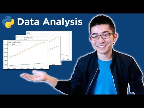
Intro to Data Analysis / Visualization with Python, Matplotlib and Pandas | Matplotlib Tutorial
ChannelCS DojoDescription from the creator
Python data analysis / data science tutorial. Let’s go!
For more videos like this, I’d recommend my course here: csdojo.io/moredata
Sample data and sample code: csdojo.io/data
My explanation about Jupyter Notebook and Anaconda: bit.ly/2JAtjF8
Also, keep in touch on Twitter: twitter.com/ykdojo
And Facebook: facebook.com/entercsdojo
Outline - check the comment section for a clickable version:
0:37: Why data visualization?
1:05: Why Python?
1:39: Why Matplotlib?
2:23: Installing Jupyter through Anaconda
3:20: Launching Jupyter
3:41: DEMO begins: create a folder and download data
4:27: Create a new Jupyter Notebook file
5:09: Importing libraries
6:04: Simple examples of how to use Matplotlib / Pyplot
7:21: Plotting multiple lines
8:46: Importing data from a CSV file
10:46: Plotting data you’ve imported
13:19: Using a third argument in the plot() function
13:42: A real analysis with a real data set - loading data
14:49: Isolating the data for the U.S. and China
16:29: Plotting US and China’s population growth
18:22: Comparing relative growths instead of the absolute amount
21:21: About how to get more videos like this - it’s at csdojo.io/moredata
For more videos like this, I’d recommend my course here: csdojo.io/moredata
Sample data and sample code: csdojo.io/data
My explanation about Jupyter Notebook and Anaconda: bit.ly/2JAtjF8
Also, keep in touch on Twitter: twitter.com/ykdojo
And Facebook: facebook.com/entercsdojo
Outline - check the comment section for a clickable version:
0:37: Why data visualization?
1:05: Why Python?
1:39: Why Matplotlib?
2:23: Installing Jupyter through Anaconda
3:20: Launching Jupyter
3:41: DEMO begins: create a folder and download data
4:27: Create a new Jupyter Notebook file
5:09: Importing libraries
6:04: Simple examples of how to use Matplotlib / Pyplot
7:21: Plotting multiple lines
8:46: Importing data from a CSV file
10:46: Plotting data you’ve imported
13:19: Using a third argument in the plot() function
13:42: A real analysis with a real data set - loading data
14:49: Isolating the data for the U.S. and China
16:29: Plotting US and China’s population growth
18:22: Comparing relative growths instead of the absolute amount
21:21: About how to get more videos like this - it’s at csdojo.io/moredata
About this tutorial
CS Dojo published this 22:01 video tutorial on October 27, 2018. It has been watched 1,540,951 times on YouTube.
Tags
Share
This tutorial in other languages
- FRIntroduction aux données Analyse / visualisation avec Python, Matplotlib et Pandas | matplotlib Tutorial
- ESIntroducción al análisis de datos / visualización con Python, Matplotlib y pandas | matplotlib Tutorial
- PTIntrodução à Análise de Dados / Visualization com Python, Matplotlib e Pandas | matplotlib Tutorial
- ITIntroduzione all'analisi dei dati / Visualizzazione con Python, Matplotlib e Pandas | matplotlib Tutorial
- DEEinführung in die Datenanalyse / Visualisierung mit Python, Matplotlib und Pandas | matplotlib Tutorial
- NLMeer informatie over Data Analysis / Visualization met Python, matplotlib en Panda's | matplotlib Tutorial
- RUВведение в анализ данных / визуализация с помощью Python, Matplotlib и панды | Matplotlib Учебное пособие
- PLWstęp do analizy danych / Wizualizacja z Python, matplotlib i pand | matplotlib Tutorial
- JAデータ分析入門/パイソン、matplotlibのとパンダと可視化| matplotlibのチュートリアル
- ARمقدمة إلى تحليل البيانات / التصور مع بيثون، Matplotlib والباندا | Matplotlib دروس
- HIपहचान डेटा विश्लेषण करने के लिए / अजगर, matplotlib और पांडा के साथ दृश्य | matplotlib ट्यूटोरियल
- IDPengenalan Analisis Data / Visualisasi dengan Python, Matplotlib dan Panda | matplotlib Tutorial